When Good Bones Meet a Bad Island: The Vinecrest Kitchen Transformation
A quality kitchen hidden inside a dated one — and how we found it.
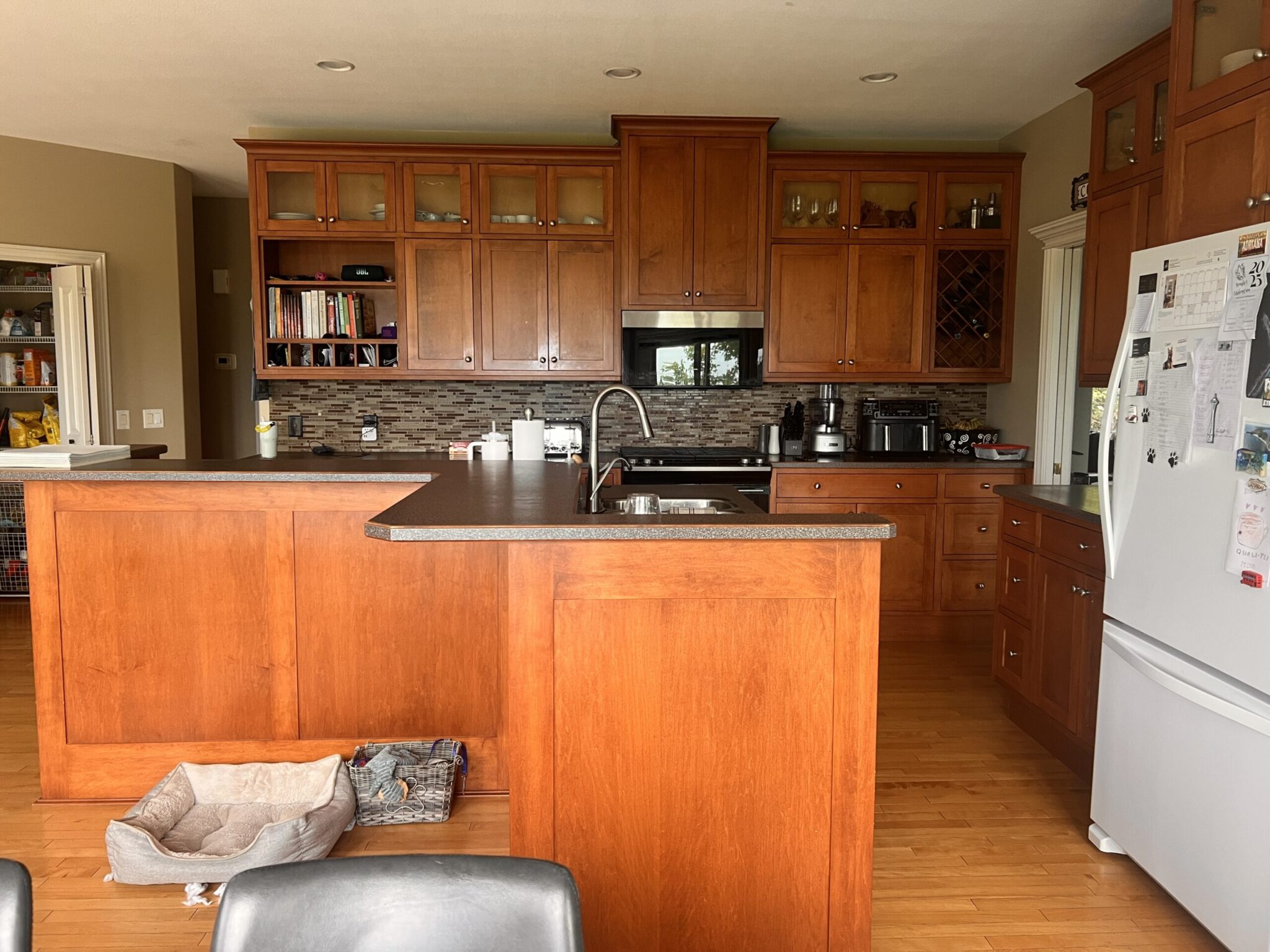
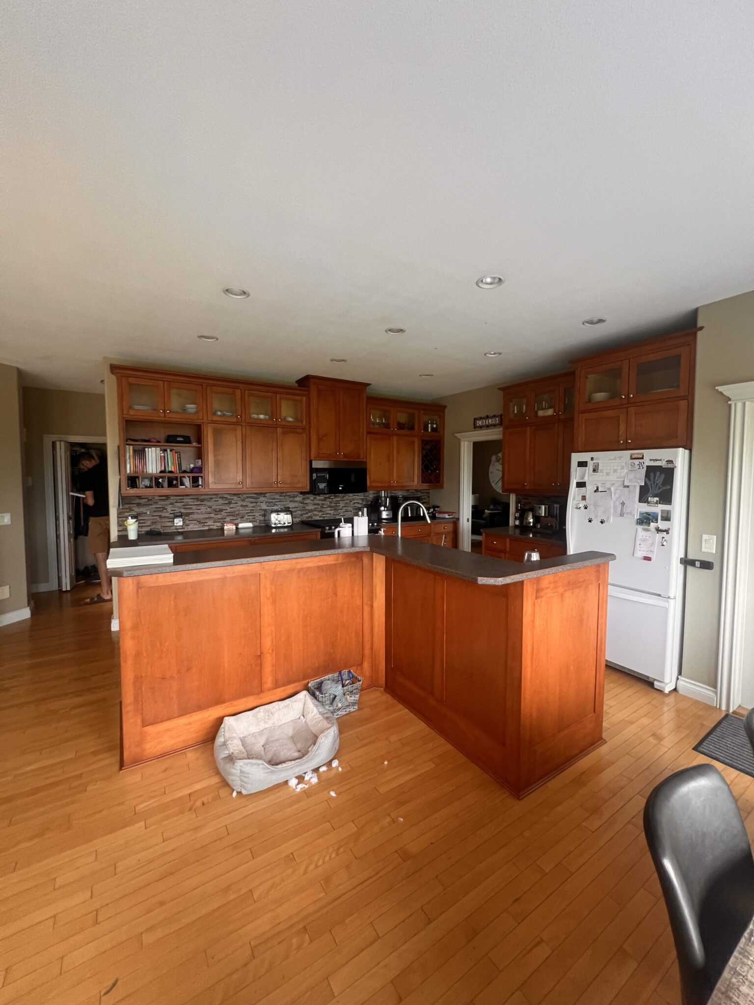
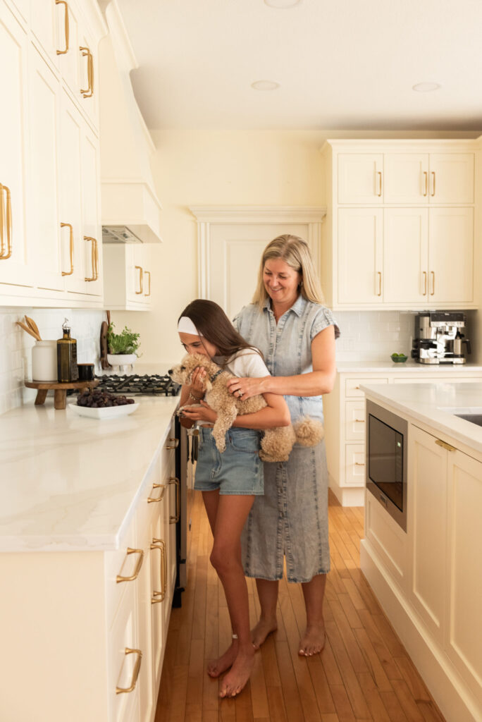
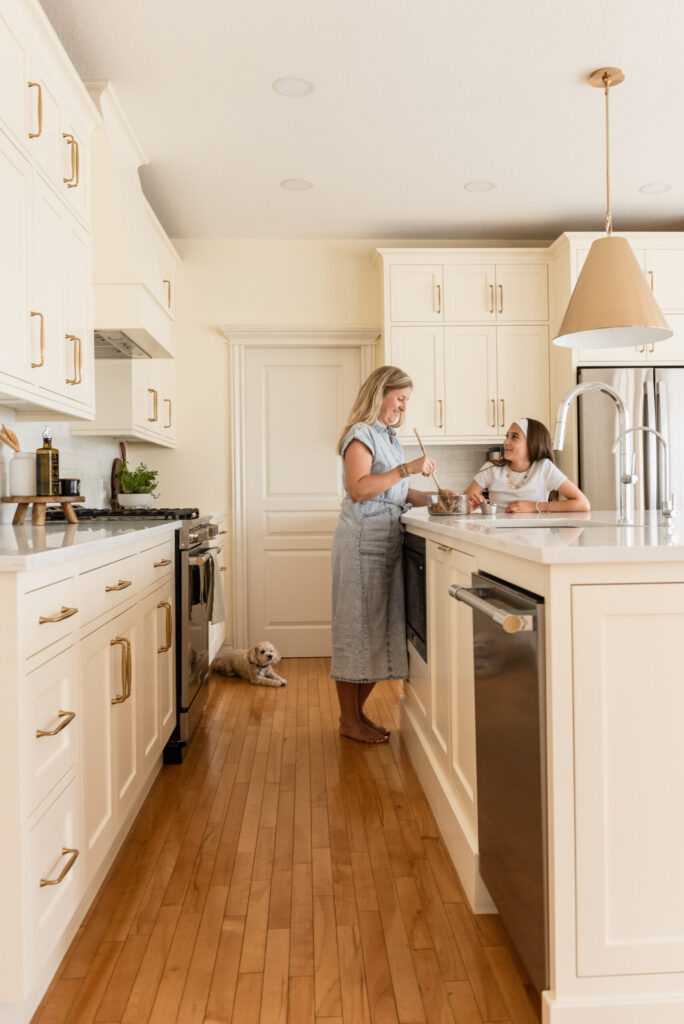
There’s a particular kind of kitchen that stops you in your tracks — not because it’s beautiful, but because you can see what it could be. The Vinecrest Kitchen was exactly that. Quality inset cabinetry, a classic two-inch matchstick floor, generous square footage, and a layout with real potential. But wedged right in the centre of all that promise? An island that was working against every single one of those things.
We’re talking a two-tiered, zig-zag L-shape that managed to simultaneously waste storage space, make seating awkward, and dominate the room in the worst possible way. Aesthetically, functionally — it wasn’t doing anyone any favours. And yet, the perimeter cabinetry was genuinely lovely. So this project became one of my favourite kinds of puzzles: how do you honour what’s working while completely reinventing what isn’t?
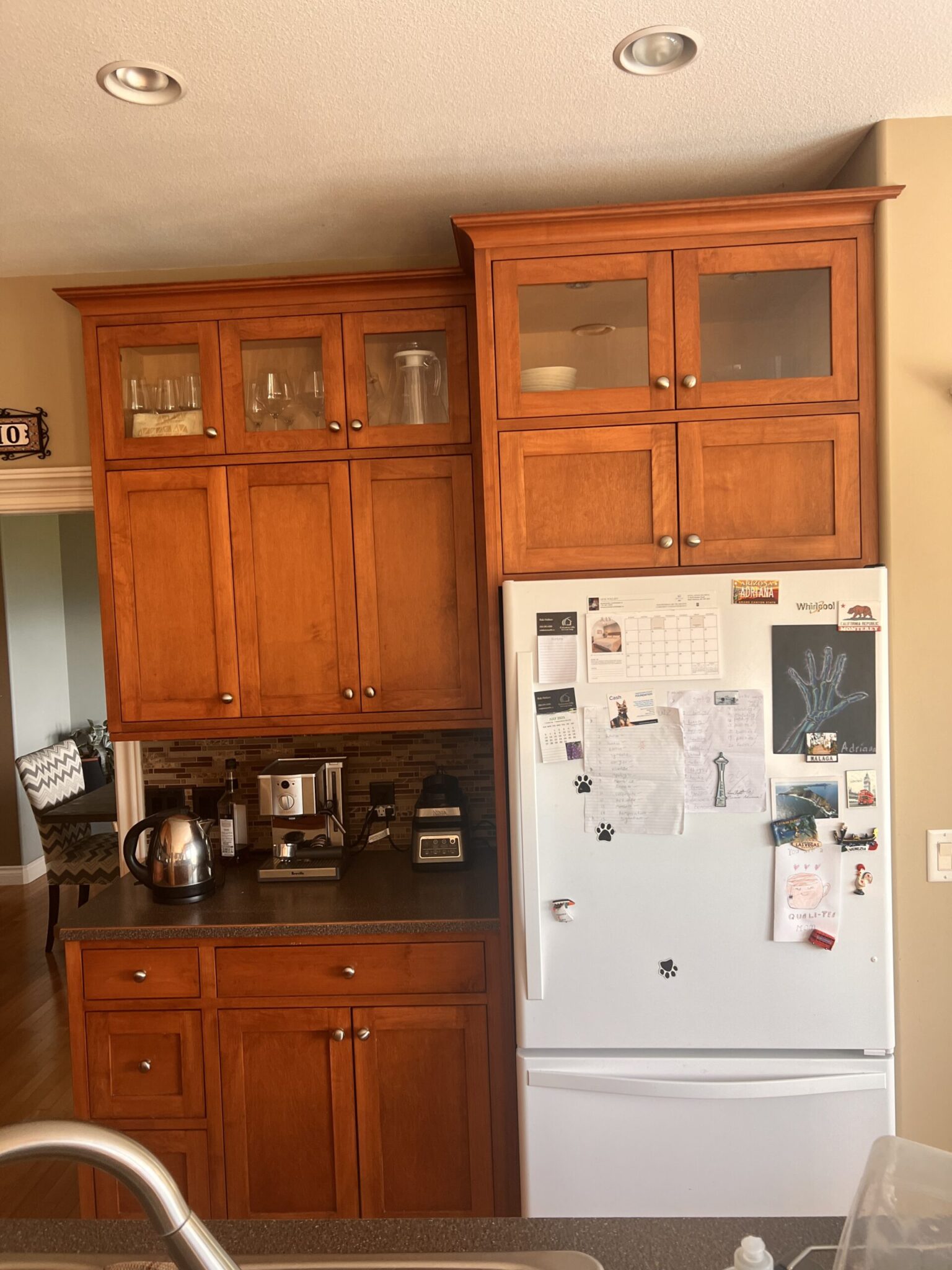
BEFORE
AFTER
The Case for a Strategic Renovation
Full gut renovations get a lot of airtime, and I understand the appeal — there’s something undeniably satisfying about a clean slate. But here’s the thing: a thoughtful partial renovation, done with intention, can deliver just as dramatic a result at a fraction of the cost. The key is knowing exactly what to keep, what to modify, and what to replace entirely.
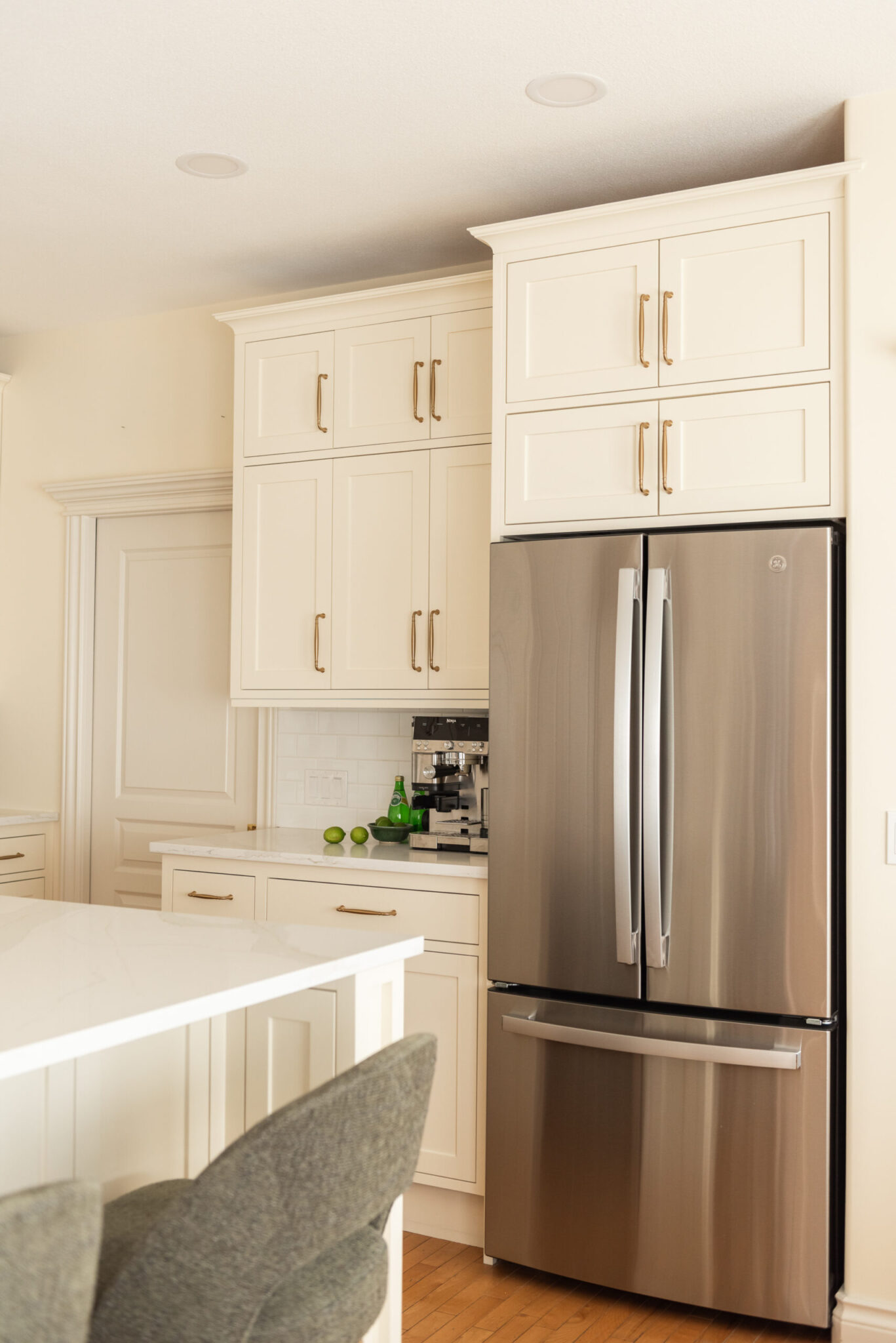
At Vinecrest, the perimeter cabinetry was built with real quality. The bones were there. So rather than tearing out everything, we made a series of considered modifications that elevated what existed while directing the full renovation energy where it would have the most impact.
What we kept — and how we improved it:
Enclosed the open organizer shelving — because open shelving sounds lovely in theory and requires a level of curation that most of us are not actually living with on a daily basis. Closing it up instantly elevated the look and gave this family somewhere to put the real stuff of life without it becoming a feature.
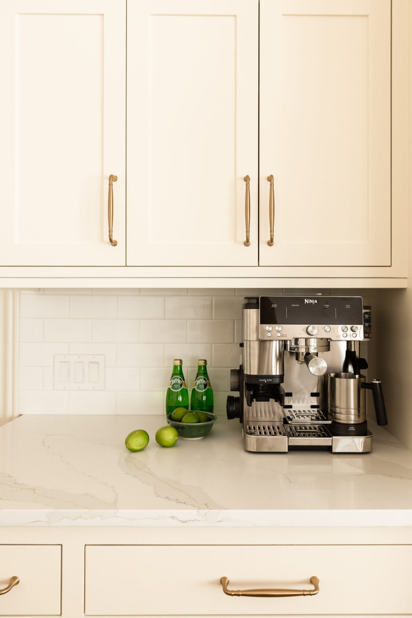
Enclosed the wine storage that flanked either end of the upper run on the back wall — integrated, polished, and far more timeless than leaving the bottles on display.
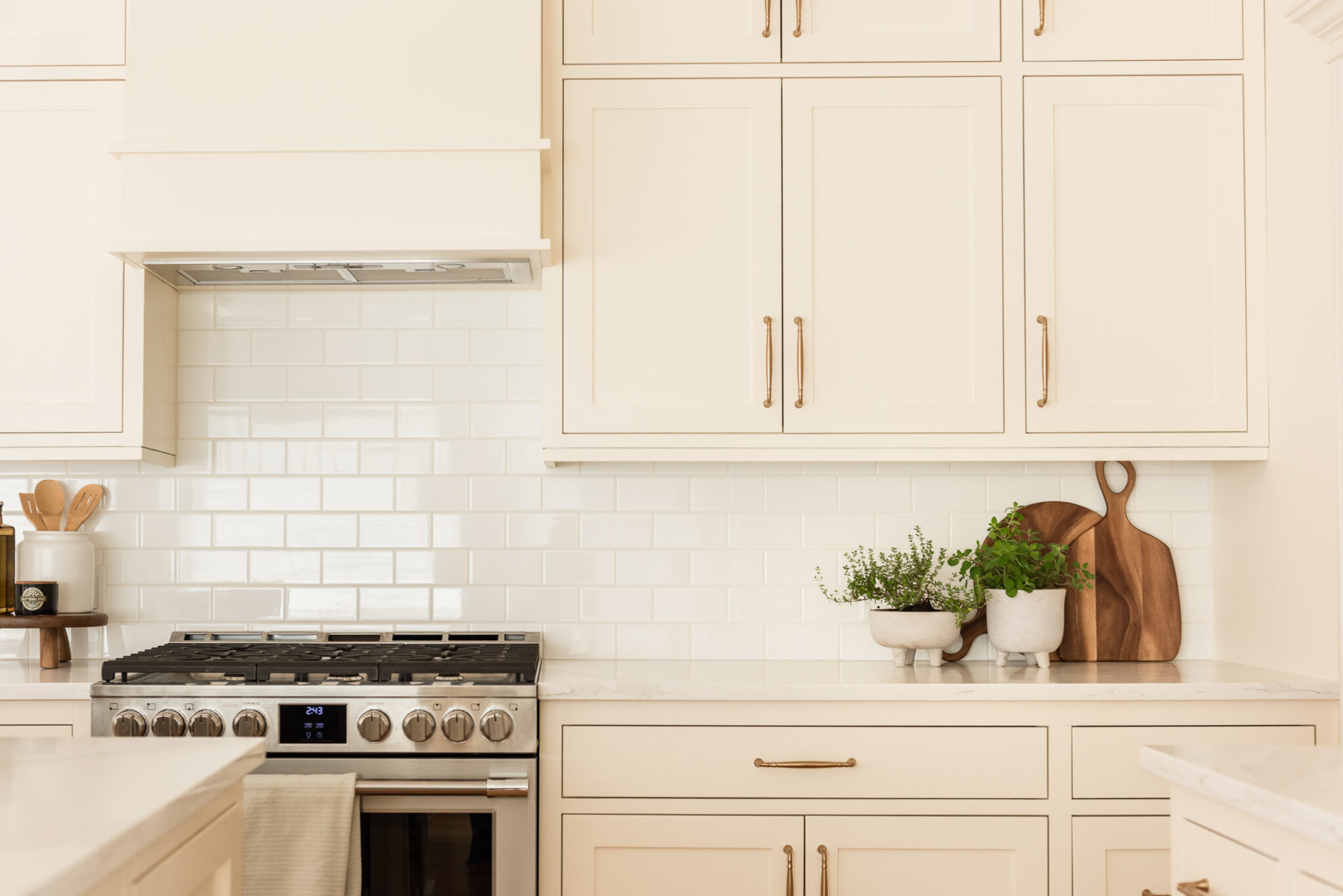
Reworked the hood fan cabinet to create a custom hood feature. Previously, the hood was concealed within a bulky cabinet that also housed the microwave, drawing unnecessary attention to itself and visually interrupting the cabinetry. By relocating the microwave and crafting a dedicated hood surround, we introduced a focal point that feels intentional, furniture-like, and much more in keeping with the classic character of the kitchen.
Modified the refrigerator cavity to accommodate a properly sized fridge. This is a detail that gets overlooked all the time in older kitchens. The existing cavity would have left awkward gaps on either side of any fridge that fit the height allowance — something no filler panel can truly fix. Modifying the upper cabinetry to allow for a taller, wider refrigerator ensured a custom fit and a much more integrated appearance.
BEFORE
AFTER
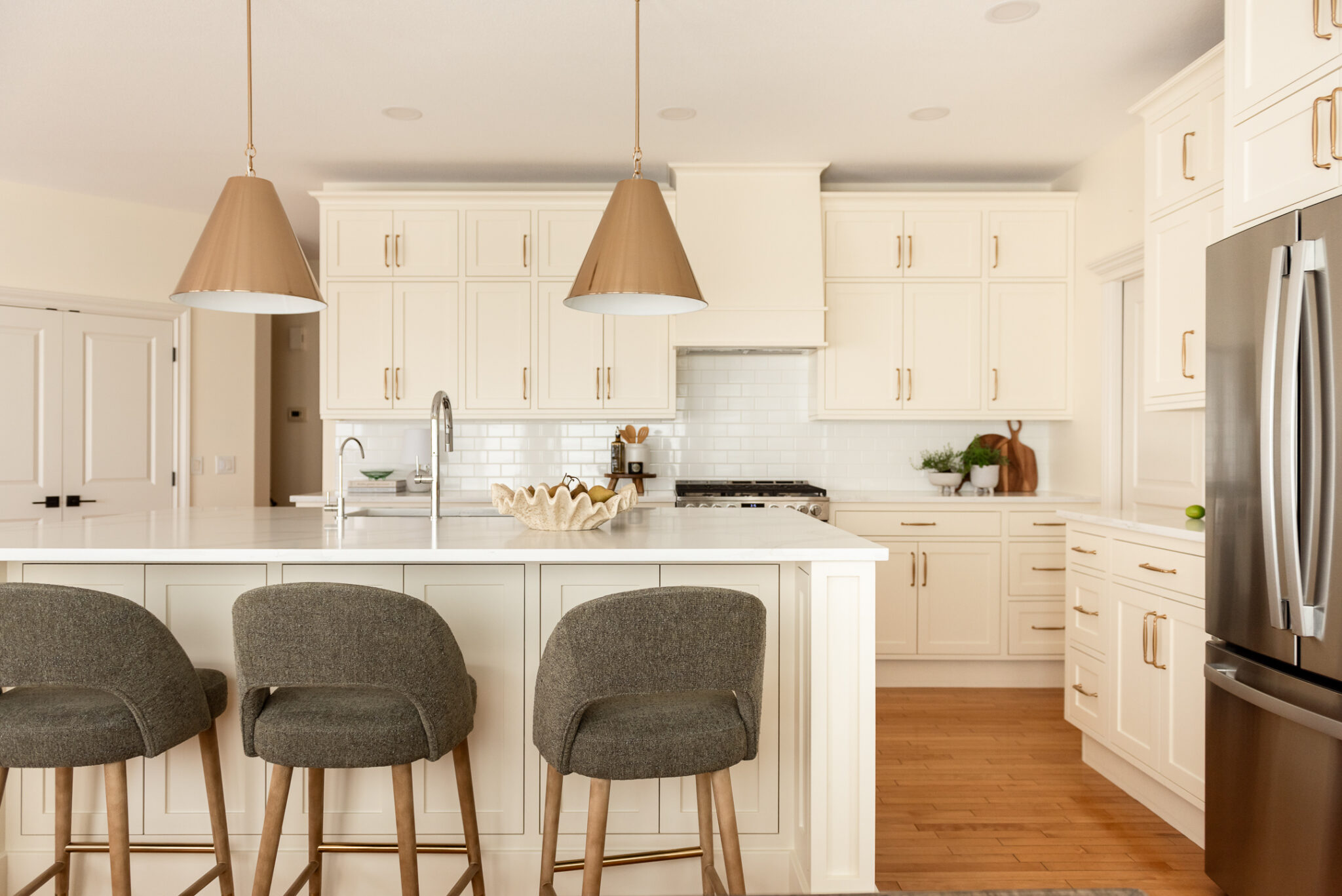
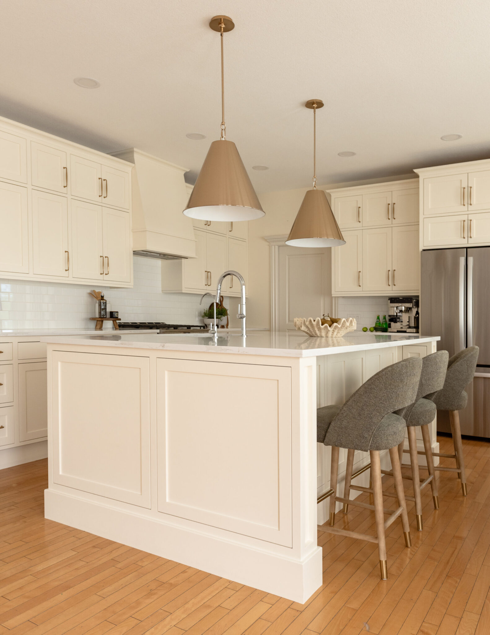
The Island: Starting From Scratch
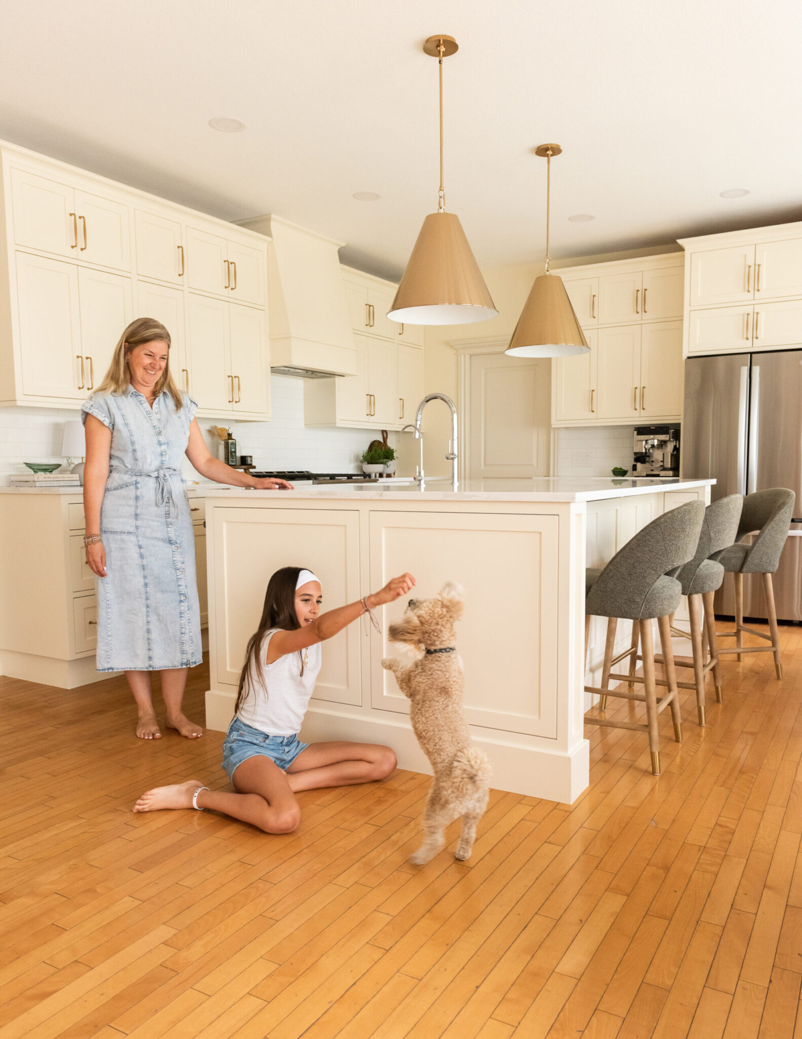
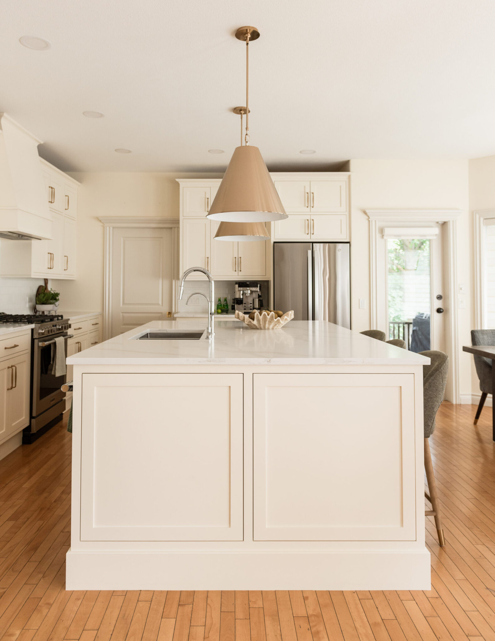
This is where the real transformation happened. We replaced that sprawling, awkward two-tiered L-shape with a single large inset-style island — and I want to be clear about what “large” means here, because it’s not just about size. It’s about what that island does.
This island works hard:
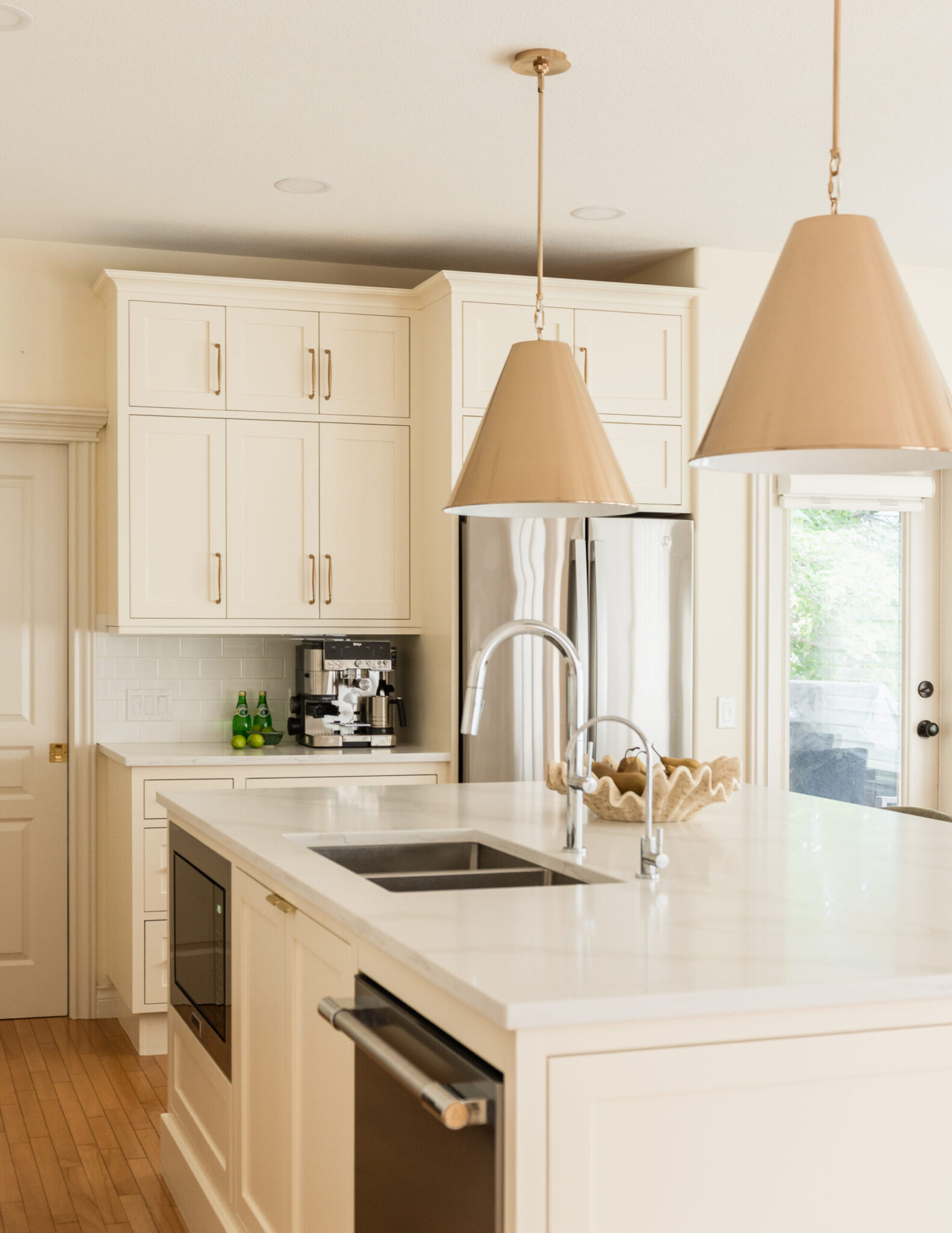
Undermount sink and dishwasher
Beverage centre and microwave
Generous storage throughout
Comfortable seating along one side
When you consolidate function like this, something interesting happens to the perception of the space: the kitchen feels bigger. More luxurious. Because instead of a clunky architectural element eating up the room, you have one beautiful, purposeful piece that earns every inch it occupies. The inset cabinetry style was a deliberate choice to complement the existing perimeter — so the new and the original feel like they were always meant to be together.
AFTER
The Floor Situation (And Why This Is Actually the Most Interesting Part)
Let’s talk about the floors, because this is where renovation gets really nuanced — and frankly, where having a designer in your corner pays for itself.
The two-inch matchstick floors at Vinecrest are genuinely charming. Timeless, actually. But they carried a warm, orange-toned stain from the 90s that was, shall we say, bossy. In an ideal world, we’d have refinished them in something a little more neutral. But because of the open-concept plan, refinishing the kitchen floor meant refinishing the entire main level, the staircase, and the second floor. That wasn’t in the cards for this project.
So we did what good designers do — we worked with it instead of pretending it wasn’t there.
When this client told me they wanted a white kitchen, I knew it was absolutely achievable. But there’s a trick to white that most people don’t know:
I didn’t reach for Chantilly Lace or White Dove
I went to the beiges — specifically the orange-toned beiges
Then I found the very lightest of those: a complex, warm cream
That is the correct white for a kitchen with these floors
“The right white isn’t always the whitest white.”
When your white carries just a whisper of the same undertone as your floor, nobody is fighting. The floor isn’t calling attention to itself. The cabinetry isn’t clashing. Everything is speaking the same quiet, harmonious language. Add brass hardware into that equation and it becomes genuinely sophisticated. Benjamin Moore Navajo White — that’s the answer for Vinecrest. Read more about choosing the right white here.
BEFORE
AFTER - same floors - complementary cream cabinets and they just look nice and warm!
AFTER
DURING - we had to patch holes due to plumbing location in old island and match the existing stain
The Finishing Details That Tie It All Together
A renovation is really a series of decisions, and it’s often the smaller ones that separate a kitchen that photographs well from one that actually lives well:
Brass hardware throughout — bridging the warm tones of the floor with the crisp quartz countertops
Classic subway tile backsplash in a brick-lay pattern with tight grout spacing — some things are classic for a reason
Large cone pendants in warm brass over the island — functional and sculptural
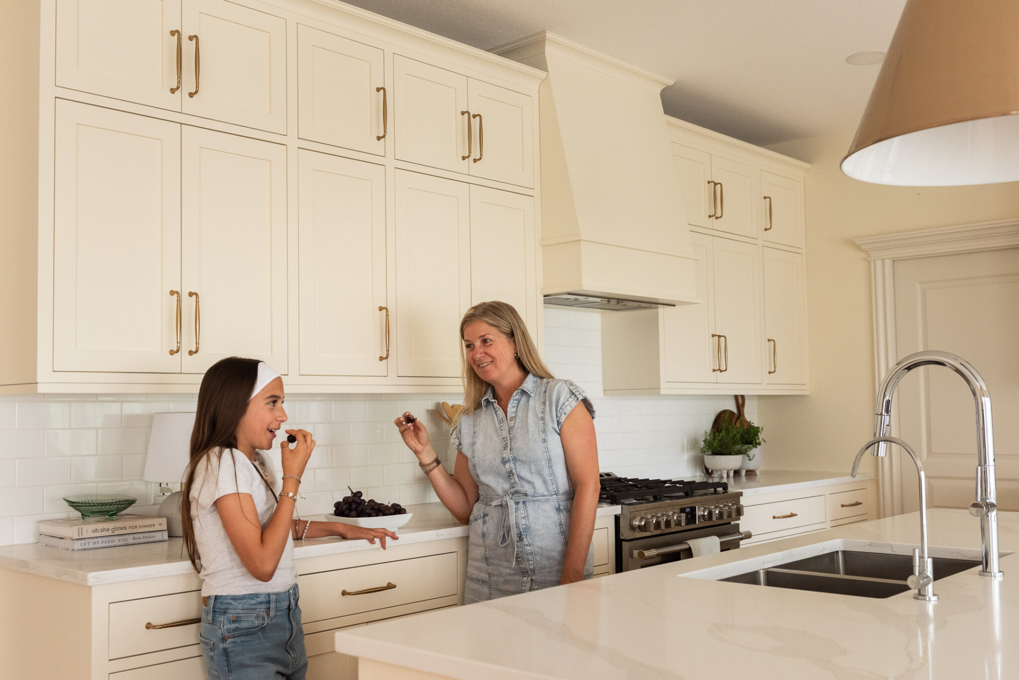
Upholstered barstools in soft textured green— going across the colour wheel from orange to green, the perfect complementary colour for a gorgeous pop while still feeling earthy and natural.
Undermount LED lighting — for practical workspace illumination, but keep them on throughout the evening for that warm glow.
BEFORE
AFTER
What This Project Teaches Us
The Vinecrest Kitchen is a reminder that transformation doesn’t require demolishing everything in your path. It requires clarity about what’s working, creativity about what isn’t, and the expertise to bridge the two in a way that feels cohesive and intentional.
If you’re sitting in a kitchen with real potential but one element that’s undermining everything else, that’s not a whole-renovation problem. That might be a very targeted, very satisfying solution waiting to happen.
And if you’re staring down an existing finish that feels like it’s running the show? Reach out. That’s exactly the kind of puzzle we love to solve.
Begin Your Journey Today
If you’re planning a renovation and could use expert guidance, explore our Interior Design Consulting Services — or, if you’re looking to partner with a design-build team you can trust, simply fill out our Contact Form or book a Free Discovery Call below to get started.
As always, thank you so much for being here, please share this with a friend who is about to renovate.
Follow along for behind-the-scenes, project progress, and daily inspiration over on Instagram @juxta.interiordesign.