Tips for Renovating for Timelessness & Sophistication
This summer has been nonstop wrapping up and photographing projects as well as beginning in on new ones, and today we’re taking you inside this sophisticated space that actually belongs to my parents! We’re so pleased with how it turned out, blending warm and cool, traditional shapes with contemporary accents, function and style…she oozes effortless sophistication, come along and I’ll share how to achieve that in your own kitchen remodel!
Tips for Renovating for timelessness and sophistication
Choose classic finishes. Although this house was built in 2003, the kitchen was influenced by 90’s trends. Honey oak, patterned tile, ice-block window detail, the zig-zag island were all dead giveaways. This is why we’re all about timeless choices in your hard finishes (the parts of your reno which are permanently installed and costly to switch out – eg. tile, cabinetry, countertops, etc). It means that someone can’t walk in and peg your space as being done in a specific design trend decade, which gives your newly renovated space a much longer shelf-life. And who doesn’t want that when you’re investing as much as you are.
Layout: Overall my parents liked the general layout, but here are the changes we made to the space planning to create a more sophisticated space:
Centred the range on the back wall for symmetry.
Straightened out the island.
Deleted the iceblock window.
Scroll through for some befores!
3. Open Concept Kitchens are such a beautiful lifestyle in our modern world, especially if you like to entertain. However, one downfall is that the inevitable clutter that a kitchen naturally collects can be on display for all to see. If you have a separate pantry space, create an area for your countertop appliances in your planning. A clutter-free space is always in vogue!
Another space saving trick we did on the other wall in the pantry, was to bump the cabinetry out more and run a shallow closet between this wall and the door casing which became the broom and central vac spot. These are the little opportunities that a trained eye can spot and really help level up your new space.
Further to the point of minimizing clutter, we added a door in front of the phone charging/mail collecting station (to the right of the fridge). Every kitchen has a dumping spot, in your redesign, look at an appliance garage to cover it up when not in use.
4. Choose a warm, yet neutral tone for your wood floors for a shade you’ll love forever. We stripped and restained the floors to reduce the overly orange tone. I am absolutely in love with this medium brown, that has just the perfect amount of warmth to it. To read more about how we chose this colour, as well as pitfalls to avoid in choosing your wood stain or wood floors, read this blog.
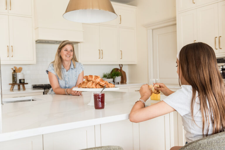
5. Master the Mix. For a timeless approach to your cabinetry hardware, vary the shapes for drawers and doors. Most people appreciate the convenience of a pull on a drawer, and a dainty knob on a door looks pretty in contrast. Here, we added a third style – cupboard latches to the little uppers along the range wall. We also used an extra long pull on the pantry cupboards.
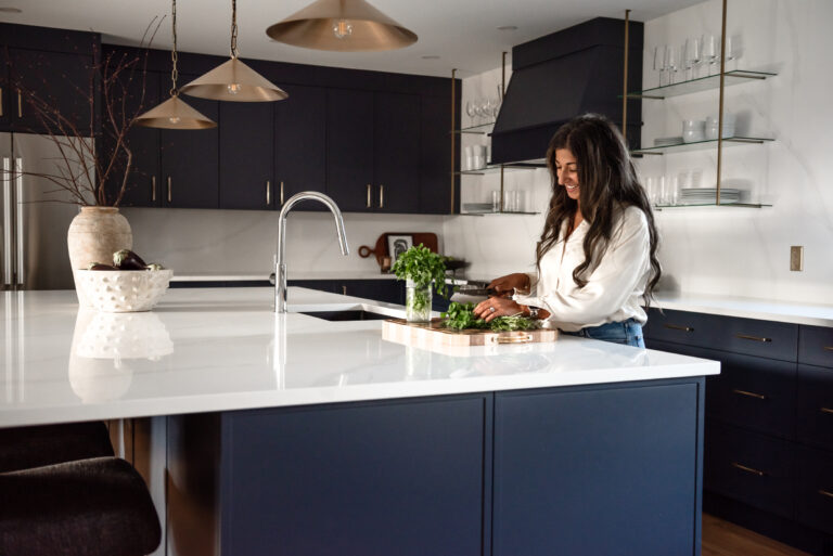
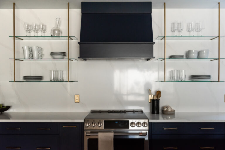
Mix the shapes, but keep the colour consistent. Here we used gold champagne on the cabinets and island chandelier, and mixed in polished nickel for the plumbing. Polished nickel is a timeless finish for plumbing, but does run you more than chrome. If budget is a concern, I prefer chrome to brushed nickel for the sparkle. It’s that little bit of jewelry, front and centre. But if we can splurge a little, polished nickel has that gorgeous warm undertone that works so well with gold champagne and the creamy cabinets too.
6. Stay Stainless for your appliances. If budget won’t allow for appliances clad in your cabinetry material (aka panel ready), then opt for stainless steel. White, black and slate stainless are all less timeless options.
7. Cabinetry: A shaker style is your most classic door style. Players choice for stain-grade vs painted. If painting, don’t choose your neutral out of hat, or based on your favourite pinterest kitchen. It’s like applying expecting your bestie’s foundation colour to be your perfect match! Because these guys wanted to keep their wall colour (a pink beige) and their cream leather couches were also a pink beige, we opted for the very lightest pink beige for their cabinetry to ensure a cohesive blend of neutrals – BM Maritime White 963. Had we slapped Pale Oak onto these cabinets (a popular creamy neutral) it would have veered violet grey on a pink beige backdrop, because Pale Oak is a violet greige. This is where working with a designer with a keen eye totally pays for itself. Afterall, one wrong choice pays for your designer!
The homeowners knew they wanted a pop for their island, and while they originally leaned towards a charcoal, we settled on this dusty navy (BM Midnight Blue 1638). Colour is always more timeless than the saturated neutral of the moment.
8. Backsplash: My top 2 timeless reno recommendations would be slab or subway.
A slab backsplash is when you continue running your countertop stone up the wall (in a thinner depth). This is such a pretty, seamless look, but definitely more costly.
If you like the contrast, keep in the world of a subway tile for something that will always be in vogue. You can vary the installation, bricklay (or offset) is what we chose here, the most traditional pattern. You could do a horizontal or vertical stack if your kitchen is more contemporary. Herringbone is a more attention-grabbing install, which works in some cases. But if you’d like the focus to be elsewhere (for example a beautiful range and hood cover) than keep your installation and grout a bit more subtle. Here we used Mapei Avalanche, a true white grout which blends with the tile.
Getting too trendy in your tile choice will have you wanting to rip it out as soon as that trend cycle ends. Remember the narrow glass tiles popular in the early 2000s? They had a variety of greys or browns to them depending on whether you were renovating in the Brown or Grey trend? Not a look that has stood the test of time. See below!
Mosaic tile is trendy and busy. Keep classic with a white/off-white or cream subway, depending on your countertop colour
Sometimes “boring” is just what we want, my friends! Remember it’s about the sum of all your choices and how they work together, not every choice should be screaming “Look at me!”
9. Cover up the hood fan. You can do this with millwork like we did here, or with plaster, like we did in this kitchen, or even tile. Unless you have a substantional and very pretty looking hood fan, it’s a higher end look to dress it up, and have it blend into other elements of the space for a sophisticated, timeless effect
10. Lastly, Styling. A house can be beautifully remodeled, but if it’s left unstyled, it’s like hitting a homer but staying on 3rd base! Bring it home with those finishing touches which make a house feel like yours.
An island sink can get messy looking without a tray corralling soaps, brushes or candles. This little trick helps it to feel decorated and intentional.
Repeat your colour palette in vases or ginger jars like we did here.
Yes, we have undercabinet lighting, but that little lamp in the corner is a pretty mood when you’re finished working and are ready to get down with the juicy conversations.
A teeny framed oil painting over the range feels precious, yet not fussy, given it could be the target of rogue spaghetti sauce at any moment. Isn’t that the exact message you’d like to communicate to guests when they come to visit? Styling can send a message, share your story, evoke a feeling…don’t neglect this last layer!
A few more photos to take us out!
Thanks as always for reading, and let us know if these tips were helpful!
Do you need help with your next renovation? Reach out to us today!
Until next time, design lovers! Meghan
Photography by Nina Maria Photography